What’s better than Christmas in July... Christmas in August! Here are a few gifts for you, compliments of our Dev team!
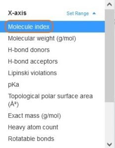
 Be sure to also explore the new options available in the plot Settings menu.
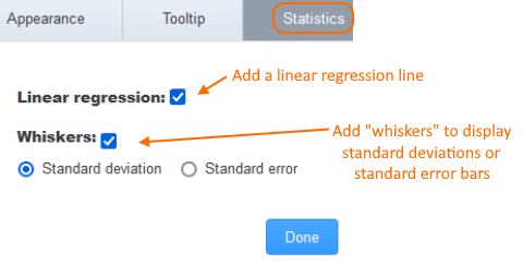
 The
Settings >
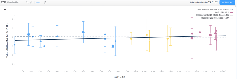
Statistics menu for scatterplots allows users to add a linear regression line, as well as whiskers that represent either the standard deviation or standard error of an averaged data point. Whiskers will appear for both axes when applicable.
 Multiple linear regression lines may be drawn. The solid line represents points that have been selected while the dotted line represents all data points.
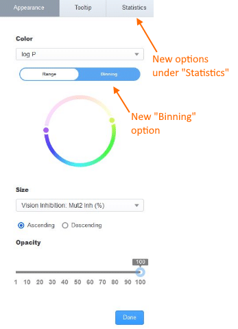
 When setting a parameter for color in your plot, you now have the option to bin values.
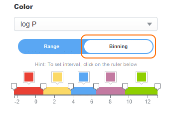 By default, three bins of equal length are created and assigned green, yellow and red colors. Keep in mind, you may
- Add as many bins as desired by clicking on the axis.
- Adjust each interval by clicking and dragging a separator, or by clicking a separator and entering a specific value.
- Click the color square to update the color or delete the interval
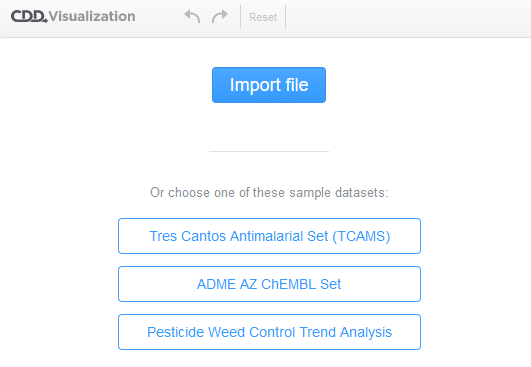
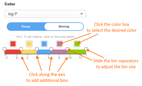 The binning option is a toggle so if you no longer wish to bin your values, click the original “Range” option within the color setting dialog. Bin ranges are saved for each parameter. Finally, we’ve heard from users that it would be handy to visualize data that has yet to be imported into CDD Vault. From an existing Visualization session, users can now launch a new session under the Actions menu.
 Once you’ve clicked the
Actions >
Launch session button, you’ll see the choice to import a data file (sdf, csv, or xlsx formats are supported) or open one of the example datasets we’ve provided.
Other posts you might be interested in
View All Posts
Events
14 min
March 27, 2025
Collaborative Drug Discovery's Inaugural Canadian User Group Meeting
Read More
CDD Blog
5 min
March 21, 2025
Drug Discovery Informatics for Big Pharma: Key Webinar Insights
Read More
CDD Vault Updates
3 min
March 19, 2025
CDD Vault Update (March #2 2025): Macromolecule Atomistic Rendering, AI Datasets, Import Inventory Locations, Larger Inventory Boxes, Dark Mode
Read More


