Visualize Your Science with CDD Visualization

It's said that with enough data, anything is possible - an assertion that some developments in predictive analytics are quickly making a reality. Especially in science, quality data collection is the first step to unlocking the chemical and biological secrets that will continue to produce restorative medical treatments, consumer protocols, agrochemical insights and more.
Despite its importance, data collection on its own is akin to finding a treasure chest you can't unlock; it's unusable without an effective way to sort, analyze, distill and disseminate pertinent findings. That's why CDD provides research teams with a comprehensive visual analysis tool.
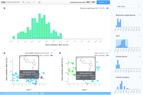
CDD Visualization is a software tool that allows users to plot and analyze large data sets to identify patterns, hotspots and outliers, as well as share findings in publication-quality graphics. It is available as a free, browser-based application, and is also part of the CDD Vault® informatics platform. This article will explore CDD Visualization, including its many features, benefits, and recent upgrades, as well as how it compares to other data science visualization tools on the market.
At CDD, we create the tools that scientists use to foster innovation. Our CDD Vault informatics platform allows research teams and individuals to store, organize, analyze and share data in powerful ways. Get a free trial and quote for our informatics system today.
A Modern Visualization Infrastructure
When confronted with a number as large as one trillion, most people won't be able to fully grasp its enormity; they might imagine its 12 zeros, its 1,000 billions, but won't conceptualize the number in a purposeful way. That's because without fractional equivalency and relational context, a mere value lacks practical applications.
Even the best minds in the world connect conceptual dots better with representations, which is why abstractions and symbols form the backbone of most mathematical and scientific disciplines. In the world of drug discovery, complex data sets that contain potentially life-altering implications can be easily overlooked without an accurate and compelling means of visual display. CDD Visualization provides researchers with a way to distill and display findings so that team members, boards, investors, publishers and the public can understand. Additionally, it helps researchers circumvent a variety of problems by providing the following benefits:
- Faster data insights. Project leaders need to be able to make stop/go decisions at key transition points, especially in expensive endeavors like drug discovery. Visualizations of real-time data and insights help researchers make confident decisions.
- Distributable findings. Visualization techniques - charts, graphs, maps, scatterplots, etc. - simplify complex ideas, allowing for easier communication of crucial takeaways.
- Interactive analysis. CDD Vault's visualization tool generates comparative representations, allowing users to mine for outliers and unique relationships.
- Affordability. Visual analysis reduces complexity, wait-time and overall cost in drug discovery endeavors. However, stand-alone data visualization software is expensive. CDD Visualization is an affordable option for academic laboratories, startups and biopharmaceutical companies.
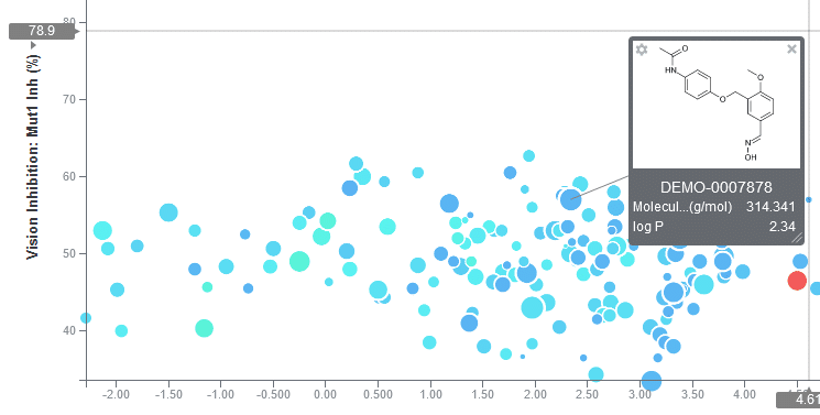
 Pin molecules and associated properties to scatter plots
CDD Visualization Updates
The field of data analytics is always evolving; to stagnate, even temporarily, in such a cutting-edge industry is to fail. At CDD, we're constantly updating our visualization features to provide you with the most current, effective models for visual representation. The most recent enhancements to our data visualization tool help users see data more clearly than ever before.
Separating Data Points
It is often useful to differentiate data points on a scatter plot based on properties. CDD Visualization makes this easy by enabling users to assign parameters to color, size, and shape.
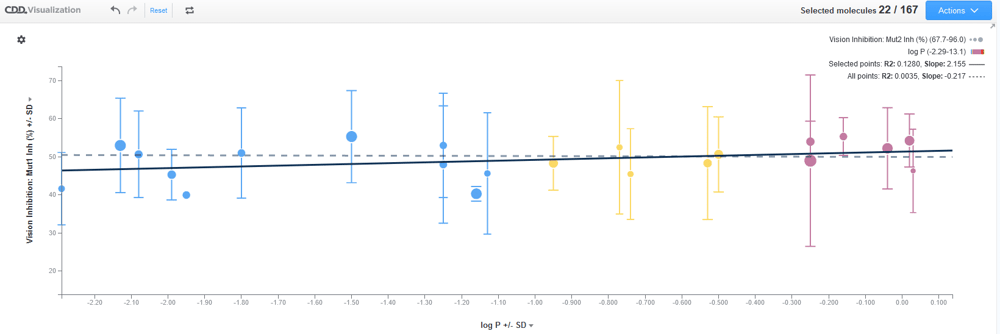
Add Statistics
This new option allows users to add a linear regression line, as well as whiskers that represent either the standard deviation or standard error of an averaged data point.
Actions Menu
This feature allows users to add a scatter plot or histogram, add their current work to a collection, save their work as a PDF, PNG or Excel, and, as of our most recent update, visualize data that has yet to be imported by clicking on the "Launch session" button. After selecting "Launch session," users can import a data file or open an example dataset provided by CDD Vault.
Scatterplot Opacity
Large data sets can produce dense clusters of points that are difficult to decipher, which is why CDD Vault recently added an opacity setting. Users can access this feature by selecting a scatterplot's settings menu and moving the opacity slider to the desired setting.
Pin Entity Details
It's not always helpful for a scatterplot to display all (or not enough) of a given molecule's many properties. CDD Visualization users can now pin entity details by shift-clicking on a data point, dragging the pop-up to a convenient location and editing which details they'd like to see.
Rearrange Plot Points
Researchers can now click on the "Rearrange" button to drag plots to a new location and delete plots they no longer want to see by clicking on the "X" in the top right corner (once in rearrange mode).
Publication-Ready Graphs and Charts
At CDD Vault, we know that the time in between when you've collated the pertinent data and when you can present that data is a period of uncertainty and potentially wasted time. That's why we've designed our visual analysis tool to generate publication-ready graphs and charts on the spot with real-time data. We're constantly improving our software's ability to produce compelling visualizations that are ready to share as soon as you are.
Data File Import
Users can now visualize data that have not been registered in CDD Vault by launching a new Visualization session and clicking "Import file". When you do this, the data files do not leave the local browser, and CDD does not store the files.
 Add linear regression lines and error bars to plots
Data Analysis and Visualization Tools
In the world of drug discovery, to present findings without a visualization tool is to risk losing critical insights in a sea of complex data. Even the most compelling speaker can't make data sets, projections and other abstractions stick as well as a visual representation can. The reason visualization tools are so successful is because they take advantage of human beings' innate ability - and desire - to detect patterns. However, visualization tools aren't just important for presentation or publication purposes; they're essential tools for exploration, too. The very act of constructing clear visual narratives requires researchers to integrate information in new ways, and doing so can reveal knowledge gaps or flawed hypotheses that would have otherwise remained buried. Data visualization tools allow researchers to explore their own insights and cogently present them, offering incalculable value to disciplines across the scientific community.
Address Public Health Concerns
At the beginning of the COVID-19 pandemic, a visual data analyst with The Economist adapted a chart from a 2007 paper by the Centers for Disease Control and Prevention (CDC) to illustrate why we must "flatten the curve." Circulated millions of times across social platforms, the chart is credited with conveying how the number of COVID-19 cases corresponds with healthcare system capacity, an interaction that would have been difficult to effectively express with words alone. The "COVID-19 Dashboard," a scatterplot of global cases created by Johns Hopkins University, and the "Coronavirus Simulator," created by The Washington Post, were also widely circulated data visualizations that assisted experts in explaining scope and transmission. Visual analysis tools bridge the gap between researchers and the public by illustrating complex findings in accessible ways. For this reason, they are essential tools for addressing public health concerns. In the wake of the COVID-19 pandemic, some healthcare professionals are calling for rapid data collection, management and visualization tools to better manage outbreak response.
Express Complex Biomedical Data
In a 2018 study published in the Annual Review of Biomedical Data Science, bioinformatics expert Seán O'Donoghue looked at data visualization principles and the role data visualization tools play in biomedical discovery and communication. He found that visualization tools play an important role in gaining insight into function, specifically in the fields of genomics and epigenetics. Emerging visualization tools may hold special promise for unlocking the secrets of RNA, molecular mechanisms associated with protein structure and cellular and tissue imaging. O'Donoghue also found that visualization tools - especially animation and video - dramatically enhance scientific communication by improving peer-to-peer communication and inspiring public engagement. Additionally, O'Donoghue asserted that although many data visualization tools are available, they're often inadequate for cutting-edge data sets. Many popular tools are cluttered, overly complicated interfaces with poorly chosen defaults. These can have negative impacts on projects and prolong dead-end research, a finding that accentuates the need for tailored tools with good visualization and design practices.
Uncover and Predict Chemical Properties
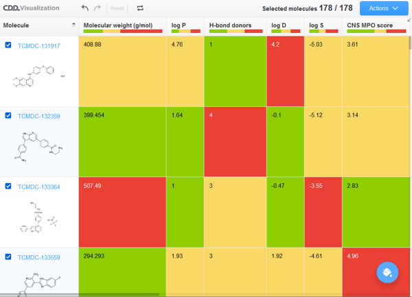
In a 2018 study that looked at data mining and visual analysis tools for predicting drug likeness, researchers found that accurate prediction of chemical properties can save time and resources, as well as generate new compounds. They looked at a data set of 762 compounds of drugs and non-drugs and then chose and calculated 35 molecular properties for each. Researchers applied the t-Distributed Stochastic Neighbor Embedding (t-SNE) method (a reduction algorithm designed for embedding high-dimensional data into a 2D or 3D space) to each of the 35 properties. They also analyzed the 35 properties with a machine learning model that combines six different algorithms. They found that both visual analysis and machine learning uncovered underlying patterns, and when used in conjunction, formed a predictive model that improved predictive force and decreased bias. These are just three of the myriad ways data visualization is used to understand topics across all life sciences. There is research to suggest data visualization tools have the potential to improve everything from patient judgements in health interventions to gauging word comprehension in preschoolers; drug discovery for every major disease to pathogen prevention and control. The implications (and possibilities) are endless when researchers have access to high-quality data visualization software.  Data table can be color coded based on custom criteria
Data Visualizer: Essential Components
In many ways, data visualization is only as effective as its software. When choosing the best data visualization tool for you, consider these four essential components:
- Distribution. This concept generally refers to frequency distribution, the probability of a particular outcome's occurrence. Frequency distributions are generally presented in histograms or curves, whereas dispersion (a type of distribution that refers to how a variable is dispersed) is commonly represented in a boxplot.
- Relationship. A data set on its own doesn't provide as much insight as a comparison between multiple data sets. Data visualization is an essential tool for identifying a relationship.
- Comparison. Data visualization software must be able to compare multiple variables in data sets or categories within a single variable.
- Composition. This visual representation technique is to illustrate the composition of one or more variables in absolute numbers and normalized forms.
CDD Visualization allows users to analyze and express data in every essential way, offering tools to interact, filter, sort, calculate, compare and publish data and insights. The benefits to CDD Visualization don't end at small data sets; this tool is ideal for big data sets as well. Whereas some data visualization software loses efficacy in drawing insights from large inputs of raw data, CDD Visualization is a practical choice for large research institutions, companies, universities and startups.
Structure-Activity Relationship (SAR) Data
To offer useful insights in the world of big data, a visual analysis tool must be able to collect and analyze Structure-Activity Relationship (SAR) data. Researchers use SAR data to predict biological activity from molecular structure, a crucial aspect of drug discovery. CDD Visualization can detect correlations and build models to evaluate new chemical structures for the purposes of predicting biological activity. Within their Vault, researchers can apply their findings to build and characterize new compounds, as well as evaluate existing compounds for likely side-effect activities. If SAR data is a crucial aspect to your work, CDD Vault's informatic software suite is ideal for you.
Data Visualization Tools Features and Cost Comparisons
As data capture and analysis tools increase in utility across all science sectors, data visualization software companies will continue to see a payday. If you're a serious researcher, you may not be able to allocate time to finding the perfect software. Two data visualization softwares commonly used by scientists are Spotfire® and Vortex. Here's a quick rundown of their pros and cons:
Spotfire
Spotfire is an analytics tool from TIBCO Software catering primarily to financial services and businesses. Users can generate dynamic visualizations of predictive data analytics.
Pros
Users report the following pros: cloud documentation, functional dashboards, ad hoc data analysis, KPI chart for executive reporting, strong location and geospatial analysis tools and easy integration with third-party databases.
Cons
Users report the following cons: expensive for small organizations and academia, unintuitive interface, complex tutorials, difficulty customizing some visualization objects, slow data load speed at the analyst level, large learning curve, slow to load software, clunky and frequent upgrades.
Vortex
Vortex is a data analysis and visualization tool by Dotmatics designed to support scientific decision-making. It specializes in cheminformatics and bioinformatics.
Pros
Users report the following pros: capable of handling databases for chemistry and biologics, electronic laboratory notebook, SAR analysis, chemical and biological registration.
Cons
Users report the following cons: poor system configuration, price, somewhat difficult to use, insufficient post-sale support.
Best Data Visualization Tools
Although both Spotfire and Vortex have their benefits, CDD Visualization offers a unique value proposition that makes it the ideal choice for most scientists. When it comes to chemoinformatics, bioinformatics, data analysis and visualization, CDD offers superior and affordable software solutions.
Spotfire vs. CDD
As a business intelligence company, Spotfire offers a lot of tools for big data analytics and reporting, including location and geospatial analysis tools. However, location-based predictive analytics aren't very useful when it comes to drug discovery. CDD Vault provides researchers with strong SAR data analysis, dynamic visualizations, real-time reporting and publication-quality graphics. Plus, Spotfire can be costly to implement, whereas researchers can use CDD Visualization for free.
Vortex vs. CDD
Vortex is a quality chemoinformatics and bioinformatics software built to enhance scientific decision-making. However, it falls short in a number of ways. Users report a poor system configuration that inhibits fluid data analysis, a less-than-great support service and difficulty of use. Conversely, CDD Visualization offers an intuitive interface with the most essential features required by researchers on a daily basis. Best of all, you can use CDD Visualization for free, meaning that academic teams and small startups with limited funds can enjoy the tools used by major research companies.

CDD Vault: Drug Discovery Informatics
Sir Mark Walport, former UK Chief Scientific Advisor and climate change expert, once said, "Science is not finished until it's communicated." Scientific information reaches its highest value when disseminated in an accessible way, which is why CDD Vault strives to provide researchers with the tools they need to communicate their findings.
Realizing that data visualization is an important way of communicating insights, we are offering free access to CDD Visualization as a service to the scientific community. Users with CDD Vault commercial licenses can also access Visualization from the integrated chemical and biological registration system, which provides the ability to visualize data that have been registered and save visualized datasets as new collections.
Whether you're working within a small startup, a university or a large company, our tools will help you see the data more clearly, make decisions at critical intervals and share your findings with the people who can put them into action. To speak with a designated technical liaison about our data management solution, contact us online.
All trademarks referenced in this article are the property of their respective owners.
Other posts you might be interested in
View All Posts
CDD Blog
3 min
October 4, 2021
CDD Gives Back with Open Access Data Visualization Tool
Read More
CDD Vault Updates
3 min
April 14, 2023
CDD Vault Update (April 2023): Cluster Analysis, Substructures as Parameters, Search filters in Visualization, and a Tautomer Parameter for the API
Read More
CDD Vault Updates
1 min
December 5, 2022
CDD Vault Update (December 2022): Add Statistical Lines to Visualization Plots and a Reminder on New Chemistry Features
Read More


